
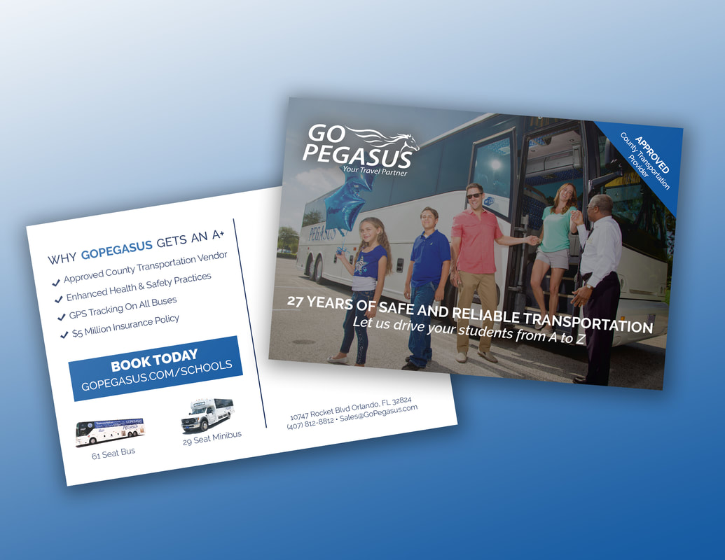
Go Pegasus
“Need to make a splash at your next meeting? Go Pegasus! We are an official travel provider for the Orange County Convention Center serving the Orlando area and beyond. From business to leisure, Go Pegasus is committed to being your travel partner. Contact us today to book your next transportation, group, leisure, educational, or corporate service.”
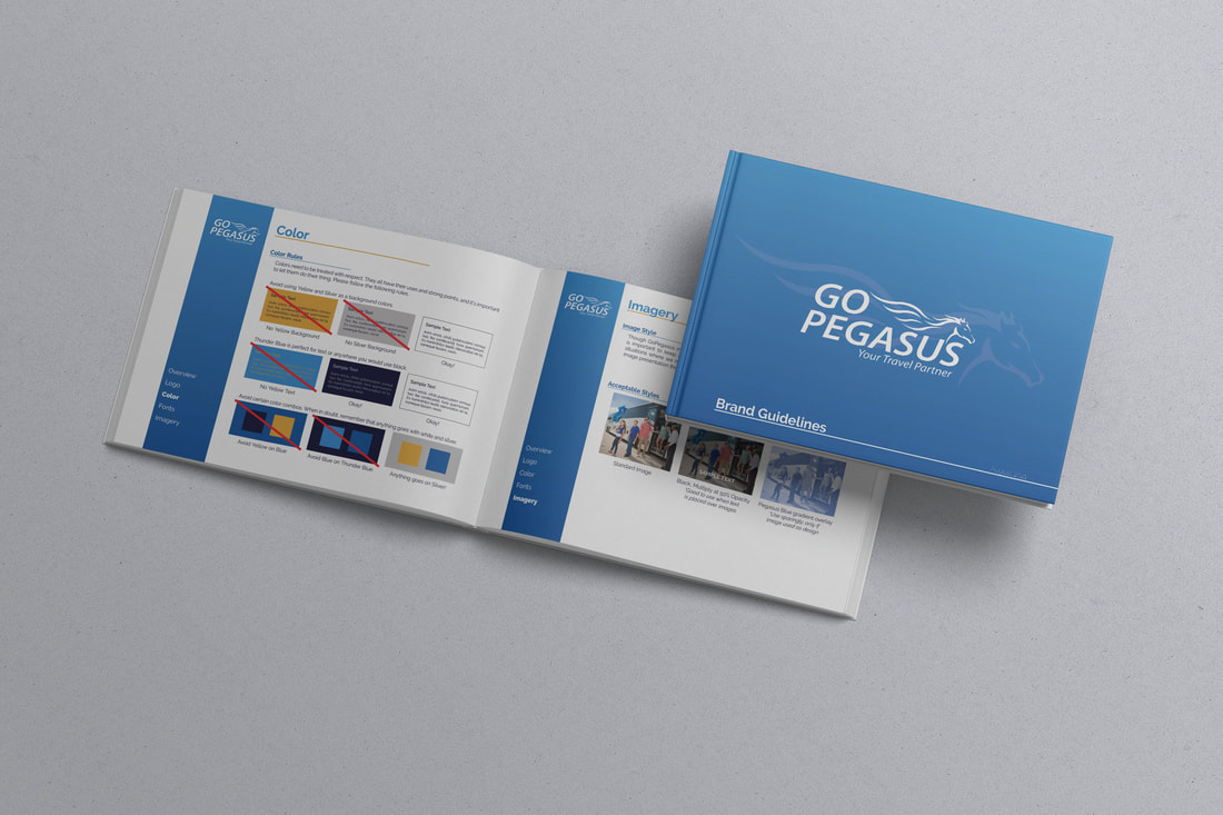
I was brought in as a contract Graphic Designer to assist the Go Pegasus marketing team in the wake of the COVID-19 Pandemic. During this time, I was able to provide them with an updated internal brand guideline as well as fresh, new promotional materials such as mailers and bus wraps.
I was brought in as a contract Graphic Designer to assist the Go Pegasus marketing team in the wake of the COVID-19 Pandemic. During this time, I was able to provide them with an updated internal brand guideline as well as fresh, new promotional materials such as mailers and bus wraps.
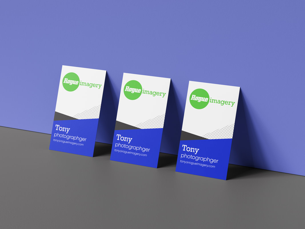
Rogue Imagery
Rogue Imagery is a creative collective -a team of artists bringing their individual visual styles together to create extraordinary memories for their clients. Miriam-Webster defines rogue as "to behave in an independent or uncontrolled way that is not authorized, normal, or expected; Breaking from the norm.”
This branding proposal, with bold and bright designs, represents the divergent nature of the word rogue and creates a visually exciting feeling for clients.
This branding proposal, with bold and bright designs, represents the divergent nature of the word rogue and creates a visually exciting feeling for clients.
MaxLiving
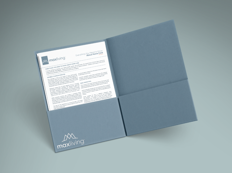
MaxLiving exists to transform lives through chiropractic. We embarked on a mission to change the way that healthcare is viewed and delivered around the world. Over nearly two decades, MaxLiving has become synonymous with best-in-class chiropractic care.
Completed a corporate rebranding effort that included a rebuild of over 50 instruction and informational booklets, conference materials, and newsletters. Reviewed material content for grammatical correctness and logical order.
Completed a corporate rebranding effort that included a rebuild of over 50 instruction and informational booklets, conference materials, and newsletters. Reviewed material content for grammatical correctness and logical order.
|
|
|
Social Media
I have worked on social media campaigns for a variety of clients. My work creates engaging and 'thumb-stopping' imagery and promotes the companies’ messages, while maintaining their own style and branding guidelines. Below are a few example posts I have created for instagram feeds.
|
|
|
Hydromate
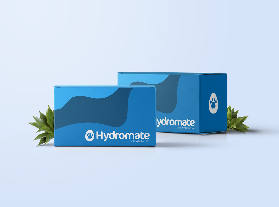
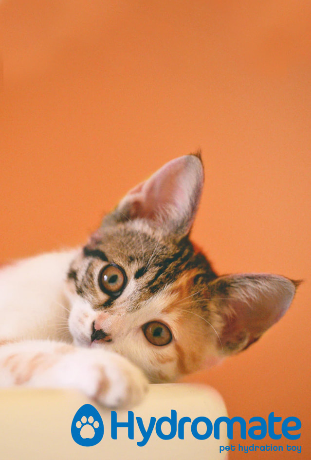
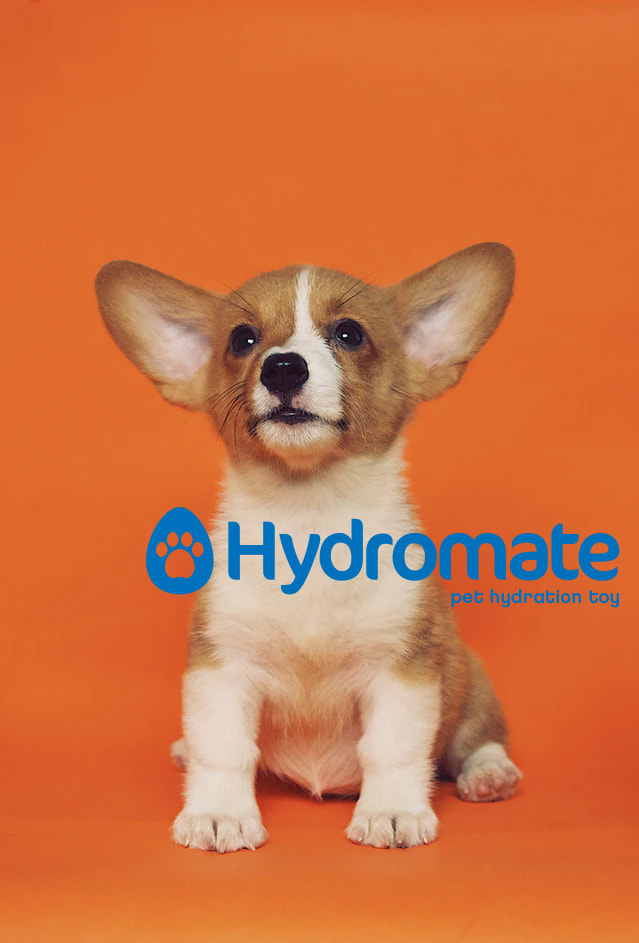
Hydromate is your pet's hydration best friend. This color-changing pet chew toy with a pet safe dye that reacts to your pets' hydration levels.
The goal of this project was to communicate the ideas of water and play. To do this, I used a curved, flowing typeface paired with bold blues (the water) with an exciting orange secondary color (to show the play). The logo itself features a paw print in a water droplet.
The goal of this project was to communicate the ideas of water and play. To do this, I used a curved, flowing typeface paired with bold blues (the water) with an exciting orange secondary color (to show the play). The logo itself features a paw print in a water droplet.
|
|
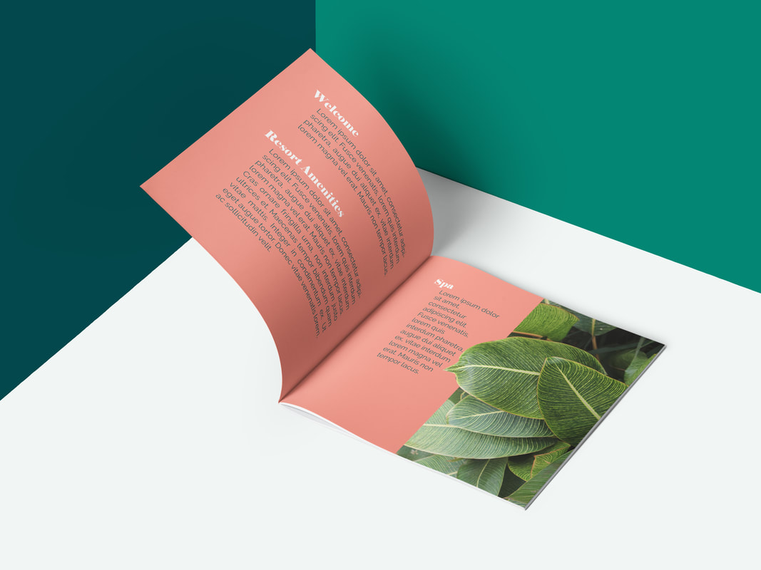
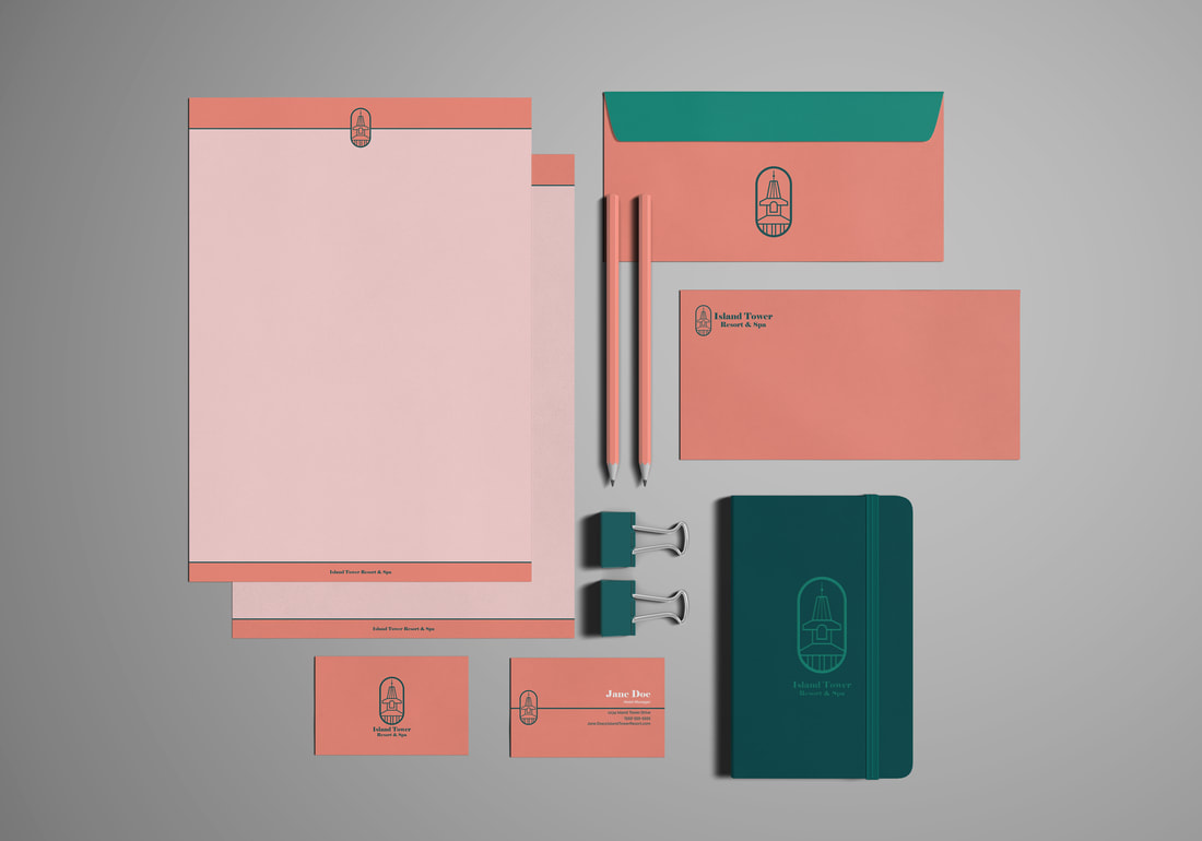
Island Tower Resort
Branding identity for a Caribbean Island-inspired resort. The logo features the eponymous tower found at the resort's lobby building. The color palette of coral and green gives the product a relaxing, natural feel.
|
|
Miscellaneous
|
|


|
|